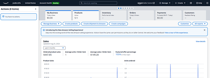
Anyone else see this? It’s like having Business Reports and Dashboard all in one. I actually like it. It’s so easy on the eyes, especially considering all the info that’s crammed into that page.
Where do you seeing it? On Seller Central main page?
Is it this thing?

Amazon is getting into the space race now too, huh?
As usual, in my opinion, it is poor GUI design. Doesn’t all fit “above the fold” on a desktop computer. Can’t image how much scrolling is necessary on phone/tablet.
The current seller dashboard is finally getting closer to being useful at a glance with all pertinent data available in one page and ability to click to expand.
Thanks for pointing it out. I had that box hidden, and wouldn’t have clicked on it even if I saw it.
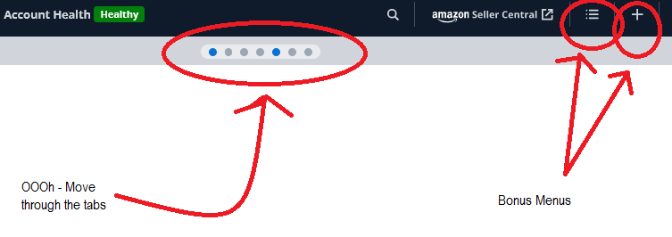
See the highlighted part below:
What do they mean by “Visiters”? Who else besides the seller are going to be looking at all those infos?
Yeah, that thing.

I agree with that. I have things I need to look at listed on Favorite bar, like yours, so it’s convenient enough and not full of things I don’t necessary need to look at a glance.
I supposed if this new format is the only thing available down the road, I’ll get used to it, but right now I’ll just keep to my old format.
We posted our reply in another spot … but was meant for here …
Literally, “Vistors to this page.”
It’s geek-speak from the UX Design dev world.
This will be the new seller central eventually.
If you hit custom, you can drag over other stuff to appear on the page and resize it.
It always crashes on adding the “payment” one (at least for me)
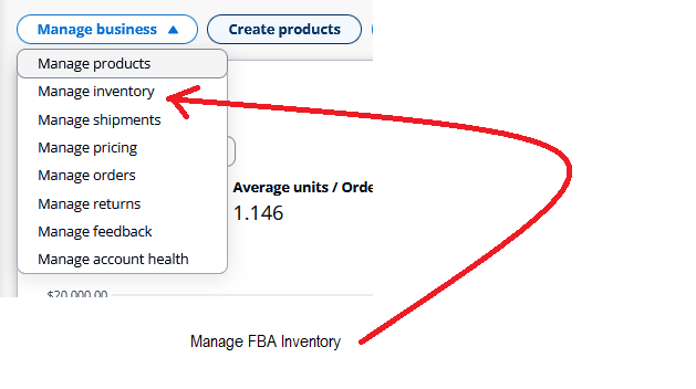
The need to clean up some of the dropdowns - to add “FBA” to the FBA ones


